
Colour

Colour is subjective. There’s no right answer. But there are definitely some firm guidelines. Pale blue, maroon and yellow for example, fall outside these guidelines (I’m looking at you Aston Villa). But then sometimes, out of nowhere, colours you assumed were hideous can work. Is there ever a reason to use mustard? Yes!


If you’re thinking about branding your business we’re more than happy to do all the colour thinking. We consider it part of the process. But if you have some ideas of your own, bear in mind some of these questions:
- Does it represent my business? Black and red for Betty’s Baby Clothing Emporium?
- Am I detracting from the product? Sometimes neutral colour schemes are best, especially if you’re selling something vibrant. The website is there to sell you, not the web designer’s flair for bravely mixing turquoise with yellow.
- Do other people hate it? This is a very important one. Someone, somewhere, likes maroon and green. That person should paint their sitting room any way they want, but keep in mind that they are not the target market. Ask your friends and family.
- Not a question, but try to only pick one colour. Every colour, even swamp green, has complementary colours but it’s hard to guess them.
If in doubt, let the web designer decide. They’re a designer for a reason. Plus they will go to Adobe Kuler and find the colour that complements swap green.

Here are some of our favourite colour examples:
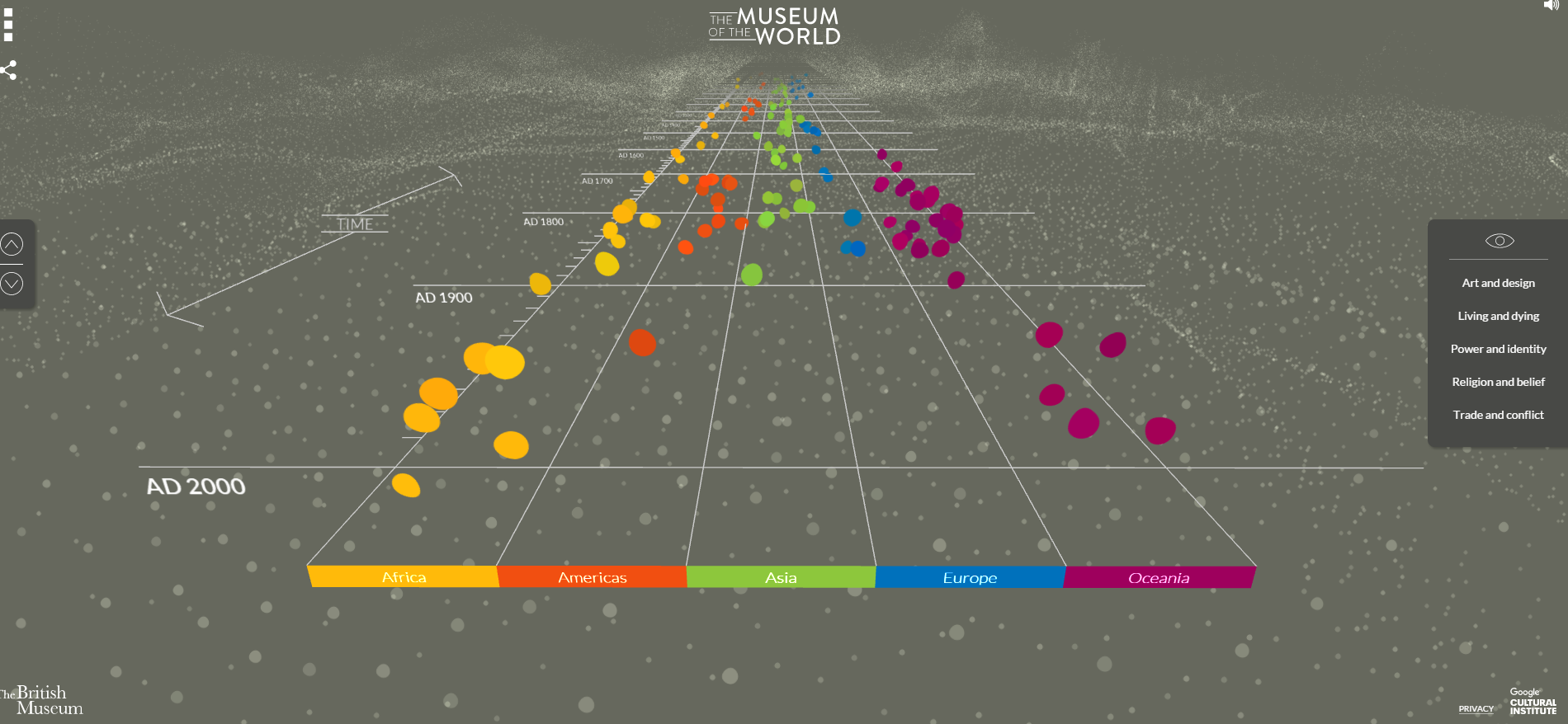
The British Museum is one of my favourite websites for a variety of reasons, I suggest you visit it right away. The interactivity is beautifully done. Colour-wise, brown background with primary accents is a bold choice, but works excellently.

Join Radio use a lovely neutral sunset palette

My Clique use purple and blue on a neutral background
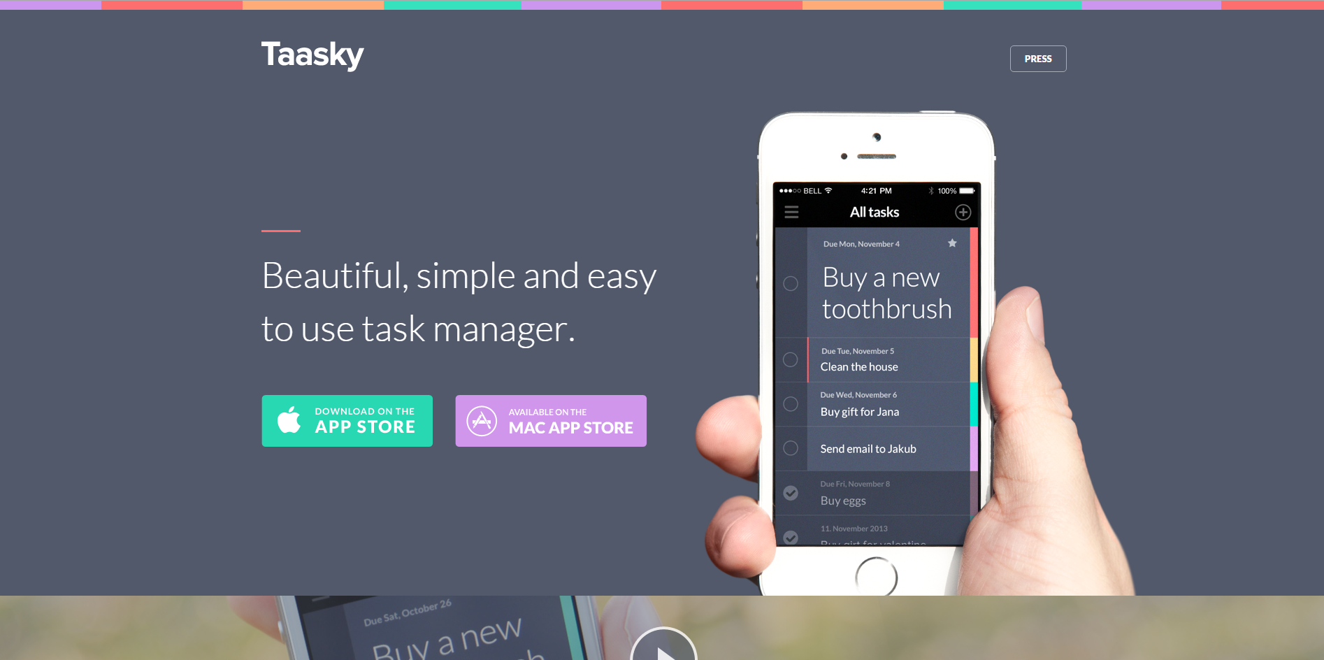
Taasky is multicoloured yet muted
Anthea

Leave a Reply
Want to join the discussion?Feel free to contribute!